

10分钟掌握seaborn绘制多子图
公众号:尤而小屋作者:Peter编辑:Peter大家好,我是Peter~本文介绍如何使用seaborn绘制多子图。
公众号:尤而小屋
作者:Peter
编辑:Peter
大家好,我是Peter~
本文介绍如何使用seaborn绘制多子图
In [1]:
import matplotlib.pyplot as plt
%matplotlib inline

import seaborn as sns
import plotly_express as px

import warnings
warnings.filterwarnings("ignore")
导入数据
In [2]:
# 内置的tips数据 基于seaborn导入方法
# tips = sns.load_dataset("tips")
In [3]:
# 基于plotly_express
tips = px.data.tips()
tips.head(3)
Out[3]:
| total_bill | tip | sex | smoker | day | time | size | |
|---|---|---|---|---|---|---|---|
| 0 | 16.99 | 1.01 | Female | No | Sun | Dinner | 2 |
| 1 | 10.34 | 1.66 | Male | No | Sun | Dinner | 3 |
| 2 | 21.01 | 3.50 | Male | No | Sun | Dinner | 3 |
In [4]:
gdp = px.data.gapminder()
gdp.head(3)
Out[4]:
| country | continent | year | lifeExp | pop | gdpPercap | iso_alpha | iso_num | |
|---|---|---|---|---|---|---|---|---|
| 0 | Afghanistan | Asia | 1952 | 28.801 | 8425333 | 779.445314 | AFG | 4 |
| 1 | Afghanistan | Asia | 1957 | 30.332 | 9240934 | 820.853030 | AFG | 4 |
| 2 | Afghanistan | Asia | 1962 | 31.997 | 10267083 | 853.100710 | AFG | 4 |
In [5]:
iris = px.data.iris()
iris.head(3)
Out[5]:
| sepal_length | sepal_width | petal_length | petal_width | species | species_id | |
|---|---|---|---|---|---|---|
| 0 | 5.1 | 3.5 | 1.4 | 0.2 | setosa | 1 |
| 1 | 4.9 | 3.0 | 1.4 | 0.2 | setosa | 1 |
| 2 | 4.7 | 3.2 | 1.3 | 0.2 | setosa | 1 |
基于FacetGrid
Seaborn中的FacetGrid是一个多维数据图形接口,通过使用它,我们可以方便地创建基于不同的分面变量的多个图形。
FacetGrid可以通过col和row等参数来一次性构建多个图形,例如使用relplot、catplot、lmplot等函数在一个Figure中绘制多个图。
这个函数之所以有这些功能,是因为函数底层使用了FacetGrid来组装这些图形。
FacetGrid绘图的x和y参数必须为DataFrame的列的名字。
In [6]:
g = sns.FacetGrid(tips, col="time")
g表示的就是待绘图的画布;而且是基于time字段进行绘制多子图。这样后续我们就可以在对象g上进行绘图。
直方图histplot
In [7]:
g = sns.FacetGrid(tips, col="time")
g.map(sns.histplot, "tip")
散点图scatterplot
In [8]:
g = sns.FacetGrid(tips, col="sex", hue="smoker")  # 1

g.map(sns.scatterplot, "total_bill", "tip", alpha=.8)  # 2
g.add_legend()  # 3

解释下代码:
- 第一行:col参数表示列方向的分组字段,hue表示颜色的分组
- 第二行:sns.scatterplot表示绘制散点图,使用
total_bill和tip两个字段绘制,alpha表示散点的透明度 - 第三行:表示添加图例,右侧的smoker(No-Yes);否则不会显示图例legend
回归散点图regplot
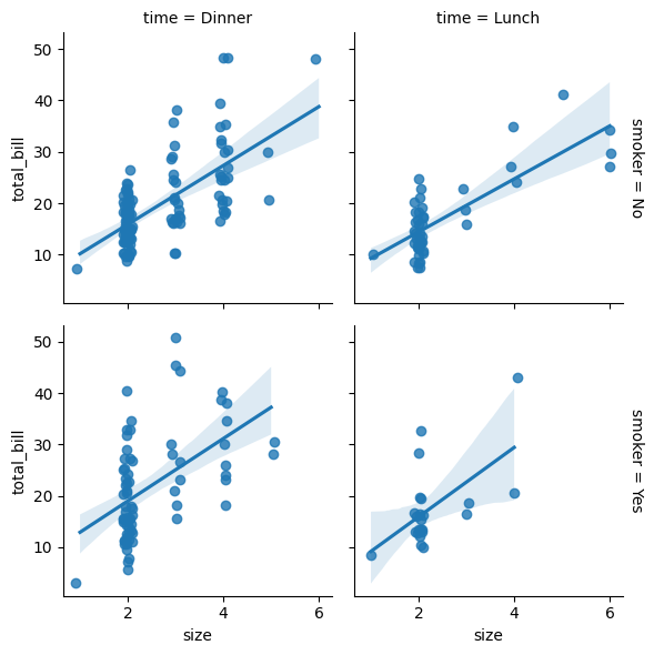
In [9]:
g = sns.FacetGrid(tips,
                  row="smoker",  # 行
                  col="time",  # 列
                  margin_titles=True  # 标题显示:True-表示行列分开,False-合并显示
                 )

g.map(sns.regplot,
      "size", "total_bill",
      # color=".2",   # color="red"
      # fit_reg=False, 是否显示拟合的回归线;默认是True
      x_jitter=.1
     )
箱型图barplot
In [10]:
g = sns.FacetGrid(tips,
                  col="day", # 列元素分组
                  height=4, # 控制高
                  aspect=.6  # 控制宽
                 )

g.map(sns.barplot,
      "sex", "total_bill",  # x-y轴
      order=["Male", "Female"] # 指定横轴sex中的显示顺序
     )

# g.add_legend()

核密度估计图kdeplot
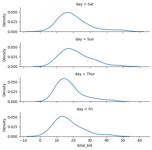
kdeplot是Seaborn库中的一个函数,用于绘制核密度估计图。
核密度估计是一种非参数统计方法,用于估计数据样本的密度函数。它通过使用核函数和权重来计算每个数据点的密度,并将所有密度值组合成一条连续的曲线,从而展示数据样本的分布特征。
In [11]:
tips.day.value_counts()
Out[11]:
Sat     87
Sun     76
Thur    62
Fri     19
Name: day, dtype: int64
表示按照每天出现的数量降序排列:
In [12]:
ordered_days = tips.day.value_counts().index
ordered_days
Out[12]:
Index(['Sat', 'Sun', 'Thur', 'Fri'], dtype='object')
In [13]:
g = sns.FacetGrid(tips,
                  row="day", # 行方向
                  row_order=ordered_days,  # 使用上面指定的顺序
                  height=1.5,
                  aspect=4)

g.map(sns.kdeplot, "total_bill")
多图(个数可控)
如果某个字段的取值存在多种情况,可以使用wrap。如果使用wrap,不能使用row参数。
比如gdp数据中的year字段:
In [14]:
gdp["year"].value_counts() # 总共12个年份
Out[14]:
1952    142
1957    142
1962    142
1967    142
1972    142
1977    142
1982    142
1987    142
1992    142
1997    142
2002    142
2007    142
Name: year, dtype: int64
In [15]:
gdp.columns
Out[15]:
Index(['country', 'continent', 'year', 'lifeExp', 'pop', 'gdpPercap',
       'iso_alpha', 'iso_num'],
      dtype='object')
In [16]:
g = sns.FacetGrid(gdp,
                  col="year",  # 列方向
                  col_wrap=4   # 分成4列,所以每行3个图(12个年份)
                 )

g.map(sns.scatterplot, "lifeExp", "pop")
设置风格style
In [17]:
with sns.axes_style("white"):
    g = sns.FacetGrid(tips, row="sex", col="smoker", margin_titles=True, height=2.5)

g.map(sns.scatterplot, "total_bill", "tip", color="#334488")

g.set_axis_labels("Total bill (US Dollars)", "Tip")  # 设置x轴的名称
g.set(xticks=[10, 30, 50], yticks=[2, 6, 10])  # 设置x-y轴的范围

g.figure.subplots_adjust(wspace=0.5,  # 左右子图的宽
                         hspace=.3  # 上下子图的高
                        )

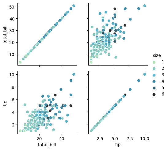
基于PairGrid(散点矩阵图)
针对数值型字段绘图
In [18]:
g = sns.PairGrid(iris.iloc[:,:-1])

g.map(sns.scatterplot)

在tips数据中,存在三个数值型字段:
In [19]:
tips.dtypes
Out[19]:
total_bill    float64
tip           float64
sex            object
smoker         object
day            object
time           object
size            int64
dtype: object
只会针对数据中的数值型字段进行绘图:
In [20]:
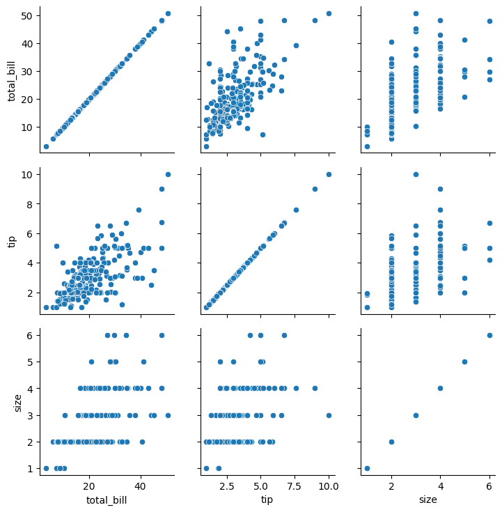
g = sns.PairGrid(tips)

g.map(sns.scatterplot)
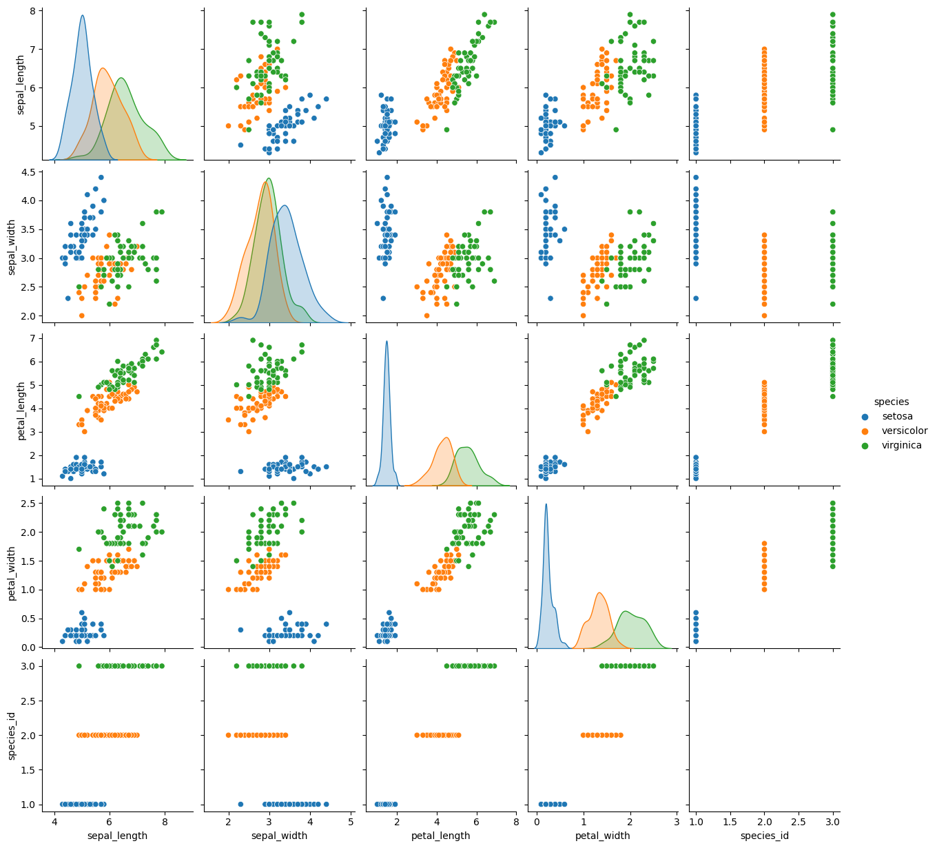
对角线绘制不同图形
在对角线和非对角线分别绘制不同的图形:
In [21]:
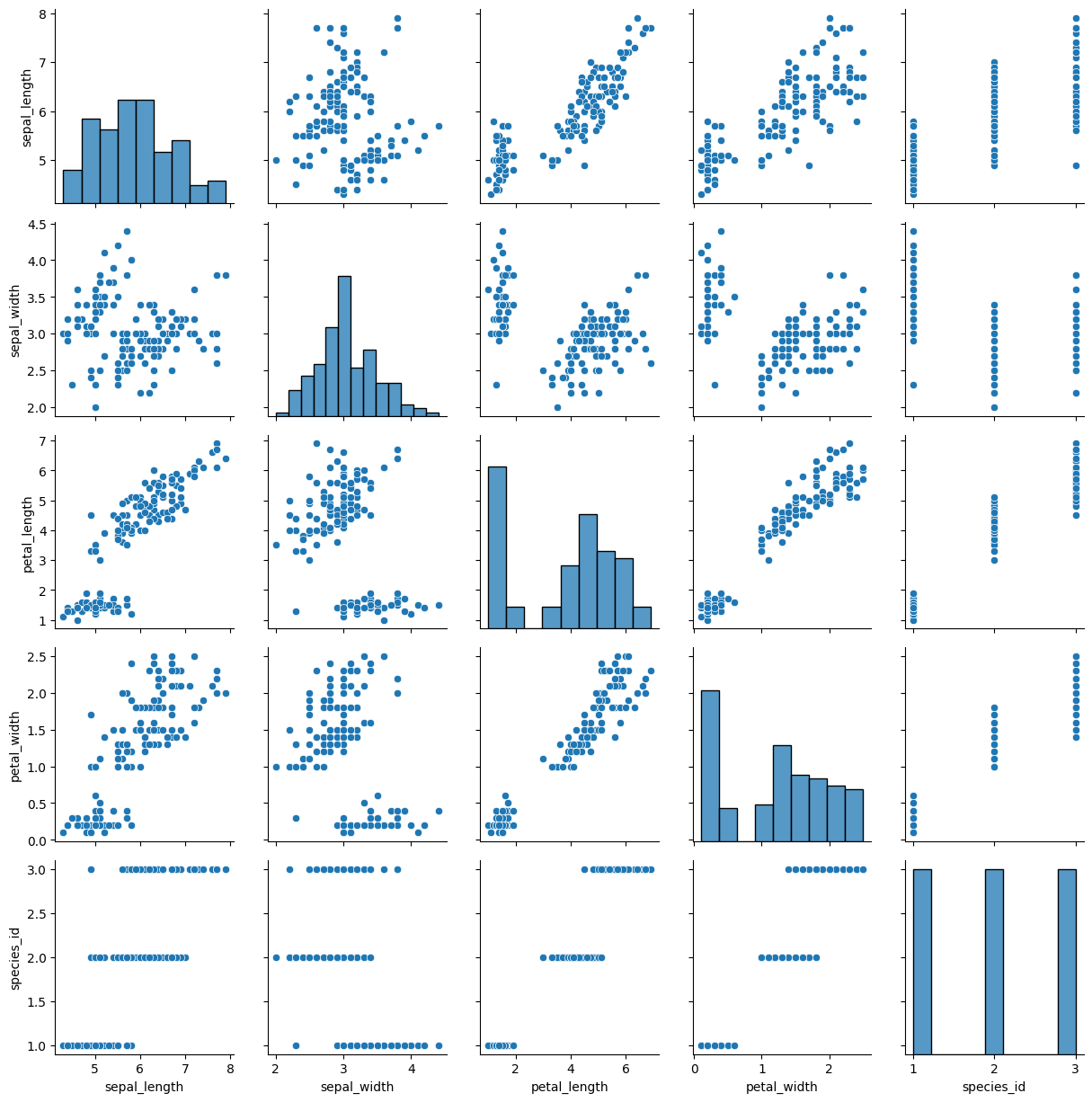
g = sns.PairGrid(iris)
g.map_diag(sns.histplot)  # 对角线
g.map_offdiag(sns.scatterplot)  # 非对角线
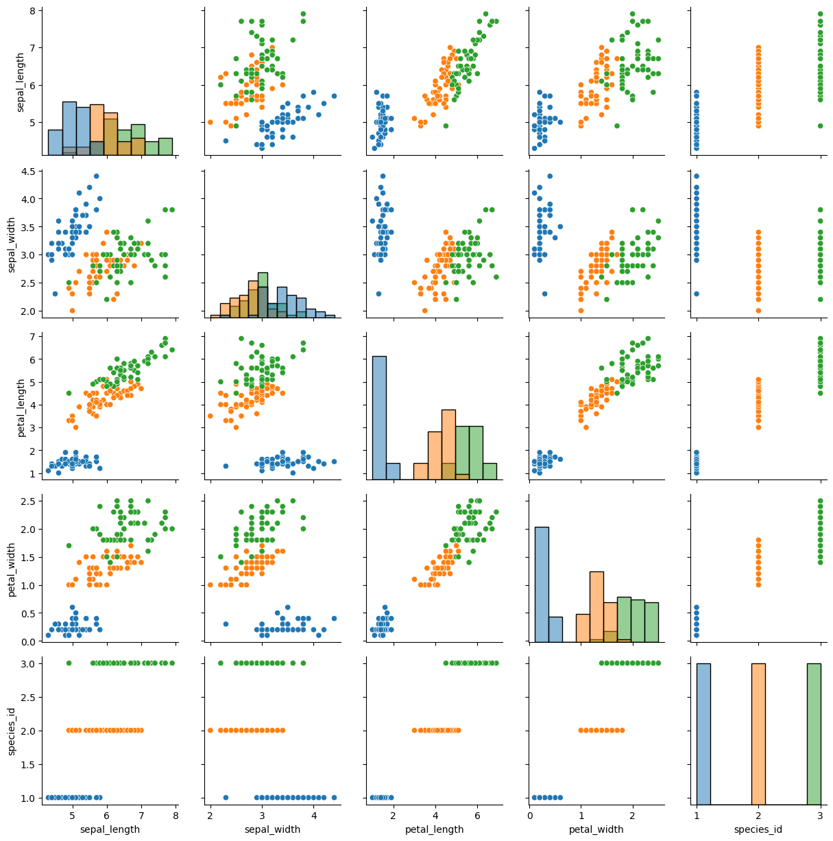
通过hue参数选择不同的分组:
In [22]:
g = sns.PairGrid(iris,hue="species")

g.map_diag(sns.histplot)  # 对角线
g.map_offdiag(sns.scatterplot)  # 非对角线
选择部分的字段绘图:通过vars参数指定
In [23]:
g = sns.PairGrid(iris, vars=["sepal_length", "sepal_width"], hue="species")

g.map(sns.scatterplot)

g.add_legend()

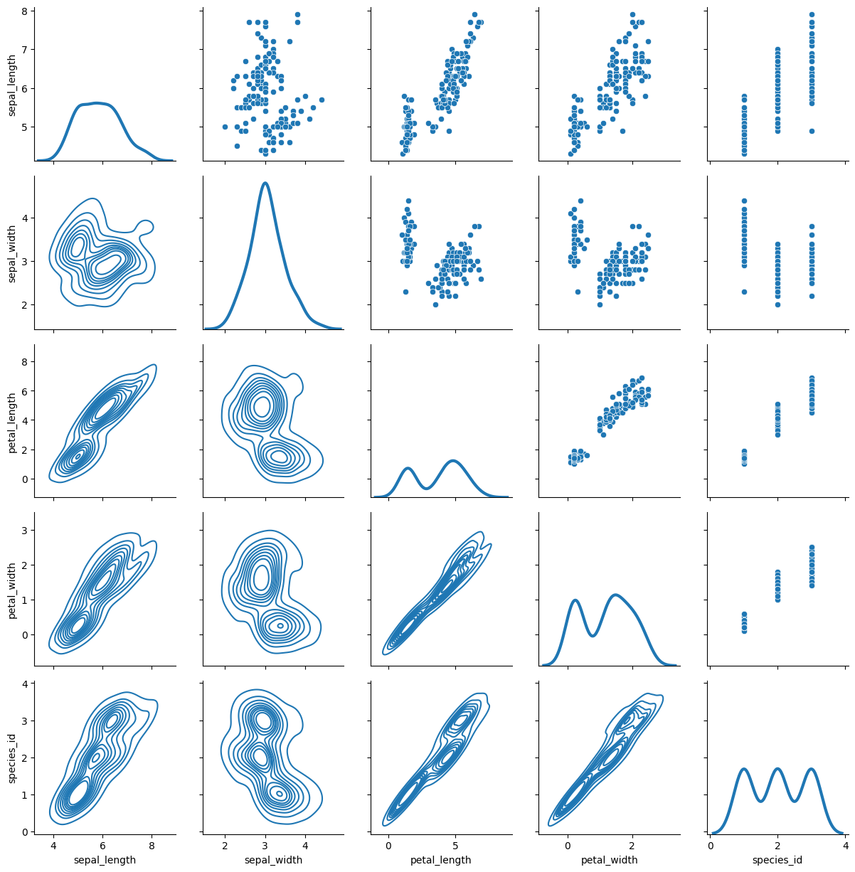
上三角、下三角和对角线分别绘制不同类型的图:
In [24]:
g = sns.PairGrid(iris)

g.map_upper(sns.scatterplot)  # 上三角
g.map_lower(sns.kdeplot)  # 下三角
g.map_diag(sns.kdeplot, lw=3, legend=False) # 对角线
行列使用不同变量绘图(非正方形)
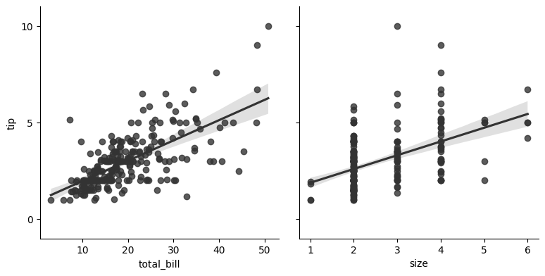
In [25]:
g = sns.PairGrid(tips,
                 x_vars=["total_bill", "size"],  # 同一个y对应两个x的值
                 y_vars=["tip"],
                 height=4)

g.map(sns.regplot, color="0.2")
g.set(ylim=(-1, 11), yticks=[0, 5, 10])
同样地,可以使用hue参数:
In [26]:
g = sns.PairGrid(tips, hue="size", palette="GnBu_d")

# g.map(plt.scatter, s=50, edgecolor="white")  # 等效如下
g.map(sns.scatterplot, s=50, edgecolor="white")
g.add_legend()
基于pariplot绘图
在Seaborn中,sns.pairplot()函数可以用于绘制数据的配对图。配对图是一种可视化方法,用于显示两个变量之间的相关性和依赖关系。sns.pairplot()函数可以同时绘制多个变量,并在图上显示它们之间的所有配对关系。
基于hue分组绘图
In [27]:
sns.pairplot(iris, hue="species", height=2.5)
指定对角线绘图类型diag_kind
In [28]:
g = sns.pairplot(iris,  # 数据
                 hue="species", # 分组
                 palette="Paired",  # 调色板  Set2  Paired  colorblind deep  muted  bright
                 diag_kind="kde",  # 对角线绘图类型
                 height=2.5  # 高度
                )


瓜分20万奖金 获得内推名额 丰厚实物奖励 易参与易上手
更多推荐

 2
2 0
0- 0


 已为社区贡献2条内容

所有评论(0)