
如何在Python Plotly中使用Plotly Express绘制多折线图?
Plotly是Python中的开源绘图库。Python用户可以使用Plotly生成不同类型的交互式基于Web的图表,包括科学图表,3D图形,统计图表,财务图表等。在本教程中,我们将展示如何使用 Plotly 生成多个折线图。在这里,我们将使用来生成图形。它包含许多方法来自定义图表并将其呈现为HTML格式。按照以下步骤使用Plotly Express生成多折线图。将模块和别名导入为。使用以下值创建数
Plotly是Python中的开源绘图库。Python用户可以使用Plotly生成不同类型的交互式基于Web的图表,包括科学图表,3D图形,统计图表,财务图表等。
在本教程中,我们将展示如何使用 Plotly 生成多个折线图。在这里,我们将使用 plotly.express 来生成图形。它包含许多方法来自定义图表并将其呈现为HTML格式。
按照以下步骤使用Plotly Express生成多折线图。
步骤 1
将 plotly.express 模块和别名导入为 px。
import plotly.express as px
步骤 2
使用以下值创建数据集 -
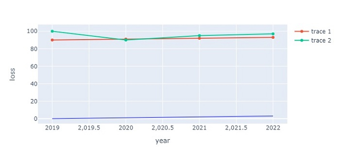
data = {
   'year':[2019,2020,2021,2022],
   'loss':[0,1,2,3],
   'gain':[90,91,92,93],
   'profit':[100,90,95,97]
}
df = pd.DataFrame(data)
步骤 3
使用 px.line() 方法创建线图。
fig = px.line(df, x='year', y='loss')
步骤 4
使用 add_scatter() 方法生成两个散点图。
# generate scatter plot
fig.add_scatter(x=df['year'], y=df['gain'])
fig.add_scatter(x=df['year'], y=df['profit'])
例
创建多折线图的完整代码如下 -
import plotly.express as px import pandas as pd # Create a dataset data = { 'year':[2019,2020,2021,2022], 'loss':[0,1,2,3], 'gain':[90,91,92,93], 'profit':[100,90,95,97] } df = pd.DataFrame(data) # generate the line plot fig = px.line(df, x='year', y='loss') # generate scatter plot fig.add_scatter(x=df['year'], y=df['gain']) fig.add_scatter(x=df['year'], y=df['profit']) # Set the size of the plot fig.update_layout(width=716, height=350) # show the plot fig.show()
输出
它将在浏览器上显示以下输出 -

瓜分20万奖金 获得内推名额 丰厚实物奖励 易参与易上手
更多推荐

 0
0 0
0- 0


 已为社区贡献10条内容

所有评论(0)