

地址:http://v3.bootcss.com/css/#overview
一、介绍
Bootstrap是Twitter开源的基于HTML、CSS、JavaScript的前端框架。
它是为实现快速开发Web应用程序而设计的一套前端工具包。
它支持响应式布局,并且在V3版本之后坚持移动设备优先。
二、目录结构
|
bootstrap-3.3.7-dist/
├── css // CSS文件
│ ├── bootstrap-theme.css // Bootstrap主题样式文件
│ ├── bootstrap-theme.css.map
│ ├── bootstrap-theme.min.css // 主题相关样式压缩文件
│ ├── bootstrap-theme.min.css.map
│ ├── bootstrap.css
│ ├── bootstrap.css.map
│ ├── bootstrap.min.css // 核心CSS样式压缩文件,我们通常用的,也是必需的
│ └── bootstrap.min.css.map
├── fonts // 字体文件,也是必须有的
│ ├── glyphicons-halflings-regular.eot
│ ├── glyphicons-halflings-regular.svg
│ ├── glyphicons-halflings-regular.ttf
│ ├── glyphicons-halflings-regular.woff
│ └── glyphicons-halflings-regular.woff2
└── js // JS文件
├── bootstrap.js
├── bootstrap.min.js // 核心JS压缩文件,我们通常用的,是必需的
└── npm.js
|
另外注意一点:因为bootstrap有些组件是根据jquery写的,所以也要有对应版本的jquery
三、bootstrap的基本模版
<!DOCTYPE html>
<html lang="zh-CN">
  <head>
    <meta charset="utf-8">
    <meta http-equiv="X-UA-Compatible" content="IE=edge">
    <meta name="viewport" content="width=device-width, initial-scale=1">
    <!-- 上述3个meta标签*必须*放在最前面,任何其他内容都*必须*跟随其后! -->
    <title>Bootstrap 101 Template</title>

    <!-- Bootstrap -->
    <link href="css/bootstrap.min.css" rel="stylesheet">

    <!-- HTML5 shim and Respond.js for IE8 support of HTML5 elements and media queries -->
    <!-- WARNING: Respond.js doesn't work if you view the page via file:// -->
    <!--[if lt IE 9]>
      <script src="https://cdn.bootcss.com/html5shiv/3.7.3/html5shiv.min.js"></script>
      <script src="https://cdn.bootcss.com/respond.js/1.4.2/respond.min.js"></script>
    <![endif]-->
  </head>
  <body>
    <h1>你好,世界!</h1>

    <!-- jQuery (necessary for Bootstrap's JavaScript plugins) -->
    <script src="https://cdn.bootcss.com/jquery/1.12.4/jquery.min.js"></script>
    <!-- Include all compiled plugins (below), or include individual files as needed -->
    <script src="js/bootstrap.min.js"></script>
  </body>
</html>
四、全局CSS样式
(一)、布局容器
Bootstrap 需要为页面内容和栅格系统 .container 容器。我们提供了两个作此用处的类。注意,由于 padding 等属性的原因,这两种 容器类不能互相嵌套。
(1)class=container 左右两边会有空白,类用于固定宽度并支持响应式布局的容器。
(2)class=container-fluid 宽度会占满100%,类用于 100% 宽度,占据全部视口(viewport)的容器。
注意两种容器不能嵌套
(二)、栅格系统
栅格系统用于通过一系列的行(.row)与列(.column)的组合来创建页面布局,你的内容就可以放入这些创建好的布局中
(1)1个行最多有12个列
(2)row必须放到container和container-fluid里面
(3)你的内容应当放置于“列(column)”内,并且,只有“列(column)”可以作为行(row)”的直接子元素。
(4)栅格参数:col-xxxx-数字,xxxx代表是哪一种屏幕,数字代表占几列,最多12,并且同一个元素可以写多个栅格参数,代表不同情况下用不同的样式
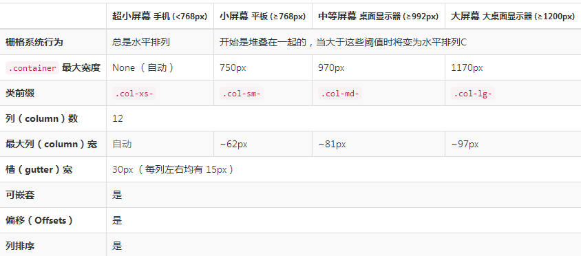
(5)注意:container有一个padding是15px,row有一个margin是-15px
补充:CSS媒体查询
@media screen and (max-width:600px){样式操作} 指的是当屏幕的宽度属于600px的范围内的时候就会采用样式操作中设定的样式
3、列偏移
col-md-offset-3 向右偏移3列,md还是指的是屏幕样式
4、列嵌套
为了使用内置的栅格系统将内容再次嵌套,可以通过添加一个新的 .row 元素和一系列 .col-sm-* 元素到已经存在的 .col-sm-* 元素内。被嵌套的行(row)所包含的列(column)的个数不能超过12(其实,没有要求你必须占满12列)。
5、列排序
以左侧为基准,push是往右移,pull是往左移
.col-md-push-9 往右移9列,md还是屏幕样式
.col-md-pull-8 往左移8列,md还是屏幕样式
(三)、排版
1、标题:small是小标题
<h1>h1. Bootstrap heading <small>Secondary text</small></h1>
<h2>h2. Bootstrap heading <small>Secondary text</small></h2> <h3>h3. Bootstrap heading <small>Secondary text</small></h3> <h4>h4. Bootstrap heading <small>Secondary text</small></h4> <h5>h5. Bootstrap heading <small>Secondary text</small></h5> <h6>h6. Bootstrap heading <small>Secondary text</small></h6>
2、页面主体
Bootstrap 将全局 font-size 设置为 14px,line-height 设置为 1.428。这些属性直接赋予 <body> 元素和所有段落元素。另外,<p>(段落)元素还被设置了等于 1/2 行高(即 10px)的底部外边距(margin)。
中心内容用.lead <p class="lead">...</p>
3、内联文本元素
(1)被删除的文本:<del>文本</del>
(2)无用文本:<s>文本</s>
(3)插入文本:<ins></ins>
(4)带下划线
(5)小号
(6)着重
(7)斜体
4、对齐
<p class="text-left">Left aligned text.</p> 左对齐
<p class="text-center">Center aligned text.</p> 居中
<p class="text-right">Right aligned text.</p> 右对齐
<p class="text-justify">Justified text.</p> 两端对齐
<p class="text-nowrap">No wrap text.</p> 这个不常用,不用管
5、改变大小写
6、缩略语
7、地址
8、引用
9、列表
(四)、代码
1、内联代码
2、用户输入
3、基本代码块
4、变量
5、程序输出
(五)、表格
1、基本实例:class=table
》》》为任意 <table> 标签添加 .table 类可以为其赋予基本的样式 — 少量的内补(padding)和水平方向的分隔线。这种方式看起来很多余!?但是我们觉得,表
》》》格元素使用的很广泛,如果我们为其赋予默认样式可能会影响例如日历和日期选择之类的插件,所以我们选择将此样式独立出来。
2、条纹状表格
》》》通过 .table-striped 类可以给 <tbody> 之内的每一行增加斑马条纹样式。
3、带边框的表格
》》》添加 .table-bordered 类为表格和其中的每个单元格增加边框。
4、鼠标悬停
》》》通过添加 .table-hover 类可以让 <tbody> 中的每一行对鼠标悬停状态作出响应。
5、紧缩表格
》》》通过添加 .table-condensed 类可以让表格更加紧凑,单元格中的内补(padding)均会减半。
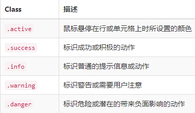
6、状态类
通过这些状态类可以为行或单元格设置颜色。每一种对应不同的颜色
7、响应式表格
》》》将任何 .table 元素包裹在 .table-responsive 元素内,即可创建响应式表格,其会在小屏幕设备上(小于768px)水平滚动。当屏幕大于 768px 宽度时,水
》》》平滚动条消失。
<div class="table-responsive"> // table外面包裹一层div
<table class="table">
...
</table>
</div>
(六)、表单
1、基本实例
》》》单独的表单控件会被自动赋予一些全局样式。所有设置了 .form-control 类的 <input>、<textarea> 和 <select> 元素都将被默认设置宽度属性为 width: 》》》100%;。 将 label 元素和前面提到的控件包裹在 .form-group 中可以获得最好的排列。
<form>
  <div class="form-group">
    <label for="exampleInputEmail1">Email address</label>
    <input type="email" class="form-control" id="exampleInputEmail1" placeholder="Email">
  </div>
</form>
2、内联表单:就是排在一行显示
》》》为 <form> 元素添加 .form-inline 类可使其内容左对齐并且表现为 inline-block 级别的控件。只适用于视口(viewport)至少在 768px 宽度时(视口宽度再
》》》小的话就会使表单折叠)。
注意:可能要手动设置宽度,必须要有label标签

<form class="form-inline">
  <div class="form-group">
    <label for="exampleInputName2">Name</label>
    <input type="text" class="form-control" id="exampleInputName2" placeholder="Jane Doe">
  </div>
  <div class="form-group">
    <label for="exampleInputEmail2">Email</label>
    <input type="email" class="form-control" id="exampleInputEmail2" placeholder="jane.doe@example.com">
  </div>
  <button type="submit" class="btn btn-default">Send invitation</button>
</form>
3、水平排列的表单
》》》通过为表单添加 .form-horizontal 类,并联合使用 Bootstrap 预置的栅格类,可以将 label 标签和控件组水平并排布局。这样做将改变 .form-group 的行
》》》为,使其表现为栅格系统中的行(row),因此就无需再额外添加 .row 了。

<form class="form-horizontal">
  <div class="form-group">
    <label for="inputEmail3" class="col-sm-2 control-label">Email</label>
    <div class="col-sm-10">
      <input type="email" class="form-control" id="inputEmail3" placeholder="Email">
    </div>
  </div>
  <div class="form-group">
    <label for="inputPassword3" class="col-sm-2 control-label">Password</label>
    <div class="col-sm-10">
      <input type="password" class="form-control" id="inputPassword3" placeholder="Password">
    </div>
  </div>
  <div class="form-group">
    <div class="col-sm-offset-2 col-sm-10">
      <div class="checkbox">
        <label>
          <input type="checkbox"> Remember me
        </label>
      </div>
    </div>
  </div>
  <div class="form-group">
    <div class="col-sm-offset-2 col-sm-10">
      <button type="submit" class="btn btn-default">Sign in</button>
    </div>
  </div>
</form>
4、还有很多样式,去网址里copy就行
(七)、按钮
1、可作为按钮使用的标签和元素
》》》为 <a>、<button> 或 <input> 元素添加按钮类(button class)即可使用 Bootstrap 提供的样式。

<a class="btn btn-default" href="#" role="button">Link</a>
<button class="btn btn-default" type="submit">Button</button>
<input class="btn btn-default" type="button" value="Input">
<input class="btn btn-default" type="submit" value="Submit">
2、预定义样式
》》》使用下面列出的类可以快速创建一个带有预定义样式的按钮。
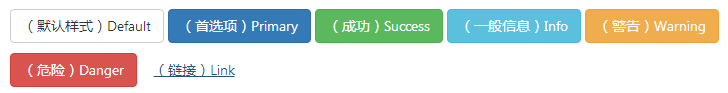
<!-- Standard button -->
<button type="button" class="btn btn-default">(默认样式)Default</button>

<!-- Provides extra visual weight and identifies the primary action in a set of buttons -->
<button type="button" class="btn btn-primary">(首选项)Primary</button>

<!-- Indicates a successful or positive action -->
<button type="button" class="btn btn-success">(成功)Success</button>

<!-- Contextual button for informational alert messages -->
<button type="button" class="btn btn-info">(一般信息)Info</button>

<!-- Indicates caution should be taken with this action -->
<button type="button" class="btn btn-warning">(警告)Warning</button>

<!-- Indicates a dangerous or potentially negative action -->
<button type="button" class="btn btn-danger">(危险)Danger</button>

<!-- Deemphasize a button by making it look like a link while maintaining button behavior -->
<button type="button" class="btn btn-link">(链接)Link</button>
3、尺寸
》》》使用 .btn-lg、.btn-sm 或 .btn-xs 就可以获得不同尺寸的按钮。
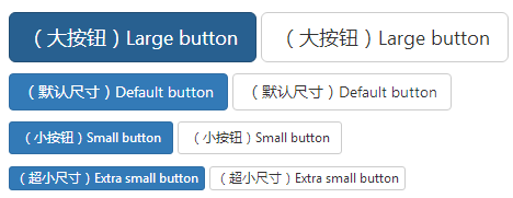
<p>
  <button type="button" class="btn btn-primary btn-lg">(大按钮)Large button</button>
  <button type="button" class="btn btn-default btn-lg">(大按钮)Large button</button>
</p>
<p>
  <button type="button" class="btn btn-primary">(默认尺寸)Default button</button>
  <button type="button" class="btn btn-default">(默认尺寸)Default button</button>
</p>
<p>
  <button type="button" class="btn btn-primary btn-sm">(小按钮)Small button</button>
  <button type="button" class="btn btn-default btn-sm">(小按钮)Small button</button>
</p>
<p>
  <button type="button" class="btn btn-primary btn-xs">(超小尺寸)Extra small button</button>
  <button type="button" class="btn btn-default btn-xs">(超小尺寸)Extra small button</button>
</p>
》》》通过给按钮添加 .btn-block 类可以将其拉伸至父元素100%的宽度,而且按钮也变为了块级(block)元素。
4、激活状态(具体在网址看)
5、禁用状态(具体在网址看)
(八)、图片(具体在网址看)
1、响应式图片
2、图片形状
(九)、辅助类
1、快速浮动
- .pull-left 左浮动
- .pull-right 右浮动
2、清除浮动
》》》通过为父元素添加 .clearfix 类可以很容易地清除浮动(float)
3、其它的在网址看
(十)、其它的在网址看


 已为社区贡献6530条内容

所有评论(0)