
react 实现文本比对差异功能(diff),模仿git提交记录
实现文本左右比对或者是放一起比对,颜色区分新增、删除、变更类型,实现出与git提交记录一样的功能
·
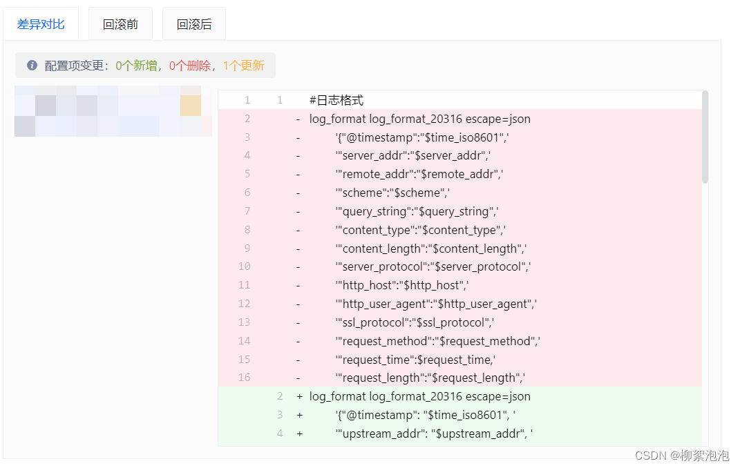
我们想实现一个与git 提交记录一样的功能。
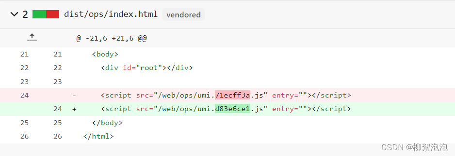
git 上面的效果是:
我们实现出来的效果是:
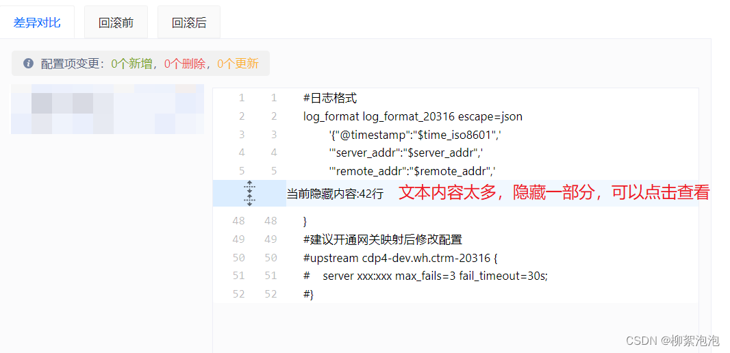
也可以实现左右比对的

接下来直接上代码
第一步老规矩:先安装插件 diff
npm i diff
yarn add diff
第二步:上代码啦
import React, { useEffect, useState } from 'react';
import { Spin, Layout } from 'antd';
import s from './index.less';
import cx from 'classnames';
import arrowSvg from './arrowSvg';

//  不支持import 语法,也就是module引入
const jsDiff = require('diff');

const { Content } = Layout;
const BLOCK_LENGTH = 5;

interface IProps {
  oldString: string; // 变更前字符串
  newString: string; // 变更后字符串
  loading: boolean;
}

interface ItemProps {
  count: number;
  added?: boolean;
  removed?: boolean;
  value: string;
}

interface InitLineProps {
  content: { hidden: string[]; head: string[]; tail: string[] };
  count: number;
  leftPos?: number | undefined;
  rightPos?: number | undefined;
  type: string;
}

const WordDiff = (props: IProps) => {
  const { oldString, newString, loading } = props;
  const [lineGroup, setLineGroup] = useState([]);

  useEffect(() => {
    let res = jsDiff.diffLines(oldString, newString);
    flashContent(res);
  }, [oldString, newString]);

  // 处理变更前和变更后的渲染数据
  const flashContent = (newArr: ItemProps[]) => {
    /* 第一步---------处理newArr数据,得到type,count,content  */
    const initLineGroup = newArr.map((item) => {
      let added = item.added;
      let removed = item.removed;
      let value = item.value;
      let count = item.count;

      const strArr = value?.split('\n').filter((item) => item) || [];

      // 判断当前状态是:新增/删除/没变化
      const type = (added && '+') || (removed && '-') || ' ';

      let head: string[], hidden: string[], tail: string[];

      // 当前状态是:没变化
      if (type !== ' ') {
        hidden = [];
        tail = [];
        head = strArr;
      } else {
        //当前状态是:新增或删除
        const strLength = strArr.length;
        // 超过十行隐藏,可点击隐藏按钮查看更多(点击一次可查看10行)
        if (strLength <= BLOCK_LENGTH * 2) {
          hidden = [];
          tail = [];
          head = strArr;
        } else {
          // 最前面10行
          head = strArr.slice(0, BLOCK_LENGTH);
          // 被隐藏得数据
          hidden = strArr.slice(BLOCK_LENGTH, strLength - BLOCK_LENGTH);
          // 最后面10行
          tail = strArr.slice(strLength - BLOCK_LENGTH);
        }
      }
      return {
        type,
        count,
        content: {
          hidden,
          head,
          tail,
        },
      };
    });

    /* 第二步---------处理initLineGroup数据  */
    let lStartNum = 1;
    let rStartNum = 1;
    initLineGroup.forEach((item: InitLineProps) => {
      const { type, count } = item;
      item.leftPos = lStartNum;
      item.rightPos = rStartNum;
      lStartNum += type === '+' ? 0 : count;
      rStartNum += type === '-' ? 0 : count;
    });
    setLineGroup(initLineGroup);
  };

  const getUnifiedRenderContent = () => {
    return lineGroup.map((item, index) => {
      const {
        type,
        content: { hidden },
      } = item;
      // 判断当前数据是否有变更
      const isNormal = type === ' ';
      return (
        <div key={index}>
          {paintCode(item)}
          {(hidden?.length && isNormal && getHiddenBtn(hidden, index)) || null}
          {paintCode(item, false)}
        </div>
      );
    });
  };

  const paintCode = (item: InitLineProps, isHead = true) => {
    const {
      type,
      content: { head, tail, hidden },
      leftPos,
      rightPos,
    } = item;
    const isNormal = type === ' ';
    // 渲染 无变化、新增、删除 样式
    const cls = cx(
      s.normal,
      type === '+' ? s.add : '',
      type === '-' ? s.removed : '',
    );
    const space = '     ';
    return (isHead ? head : tail).map((sitem: string, sindex: number) => {
      // 渲染最左边的两排序号
      let posMark = '';
      if (isNormal) {
        const shift = isHead ? 0 : head.length + hidden.length;
        posMark =
          (space + (leftPos + shift + sindex)).slice(-5) +
          (space + (rightPos + shift + sindex)).slice(-5);
      } else {
        posMark =
          type === '-'
            ? getLineNum(leftPos + sindex) + space
            : space + getLineNum(rightPos + sindex);
      }
      return (
        <div key={(isHead ? 'h-' : 't-') + sindex} className={cls}>
          <pre className={cx(s.pre, s.line)}>{posMark}</pre>
          <div className={s.outerPre}>
            <div className={s.splitCon}>
              <div className={s.spanWidth}>{' ' + type + ' '}</div>
              {getPaddingContent(sitem)}
            </div>
          </div>
        </div>
      );
    });
  };

  //  获取split下的内容node
  const getPaddingContent = (item: any) => (
    <div className={cx(s.splitCon)}>{item}</div>
  );

  // 处理隐藏区域的数据和展示
  const getHiddenBtn = (hidden: string[], index: number) => {
    // 点击隐藏按钮,判断是否能全部展示完
    const isSingle = hidden.length < BLOCK_LENGTH * 2;
    return (
      <div key="collapse">
        <div className={cx(s.colLeft, '')}>
          {isSingle ? (
            <div className={s.arrow} onClick={() => openBlock('all', index)}>
              {arrowSvg()}
            </div>
          ) : (
            <React.Fragment>
              <div className={s.arrow} onClick={() => openBlock('head', index)}>
                {arrowSvg()}
              </div>
              <div className={s.arrow} onClick={() => openBlock('tail', index)}>
                {arrowSvg()}
              </div>
            </React.Fragment>
          )}
        </div>
        <div className={cx(s.collRight, '')}>
          <div
            className={cx(s.colRContent, isSingle ? '' : s.cRHeight)}
          >{`当前隐藏内容:${hidden.length}行`}</div>
        </div>
      </div>
    );
  };

  const getLineNum = (number: number) => {
    return ('     ' + number).slice(-5);
  };

  // 点击隐藏按钮
  const openBlock = (type: string, index: number) => {
    const copyOfLG = lineGroup.slice();
    const targetGroup: InitLineProps = copyOfLG[index];
    console.log('targetGroup: ', targetGroup);
    const { head, tail, hidden } = targetGroup.content;
    if (type === 'head') {
      targetGroup.content.head = head.concat(hidden.slice(0, BLOCK_LENGTH));
      targetGroup.content.hidden = hidden.slice(BLOCK_LENGTH);
    } else if (type === 'tail') {
      const hLenght = hidden.length;
      targetGroup.content.tail = hidden
        .slice(hLenght - BLOCK_LENGTH)
        .concat(tail);
      targetGroup.content.hidden = hidden.slice(0, hLenght - BLOCK_LENGTH);
    } else {
      targetGroup.content.head = head.concat(hidden);
      targetGroup.content.hidden = [];
    }
    copyOfLG[index] = targetGroup;
    setLineGroup(copyOfLG);
  };

  return (
    <Spin spinning={loading}>
      <Content className={s.test_content}>
        <div className={s.color}>{getUnifiedRenderContent()}</div>
      </Content>
    </Spin>
  );
};

export default WordDiff;
第三步:上样式啦
.test_content {
  padding-left: 2%;
  padding-right: 2%;
  background-color: rgba(255, 255, 255, 0.2);
  // 框得样式
  .color {
    color: black;
    background-color: #fff;
    border-radius: 4px;
    border: 1px solid #ddd;
  }

  // 默认色
  .normal {
    color: black;
  }

  // 新增
  .add {
    background-color: rgb(236, 253, 240);
  }

  // 删除
  .removed {
    background-color: rgb(251, 233, 235);
  }

  .pre {
    margin: 0;
    vertical-align: top;
    display: inline-block;
  }

  // 左边序号的宽度
  .line {
    color: rgba(27, 31, 35, 0.3);
    width: 88px;
  }

  // 右边内容宽度
  .outerPre {
    width: calc(100% - 88px);
    display: inline-block;
  }

  // 右边-内容样式
  .splitCon {
    display: inline-block;
    white-space: pre-wrap;
    vertical-align: top;
    width: calc(100% - 24px);
  }

  .spanWidth {
    width: 20px;
    display: inline-block;
    white-space: pre-wrap;
  }

  // 隐藏内容样式
  .colLeft {
    display: inline-block;
    color: #586069;
    width: 88px;
    background-color: #dbedff;
  }

  //箭头- 鼠标hover隐藏行给出样式
  .arrow {
    display: flex;
    align-items: center;
    justify-content: center;
  }

  .arrow:hover {
    color: #fff;
    background-color: #1872ff;
  }

 // 当前隐藏内容多少行
  .collRight {
    display: inline-block;
    width: calc(100% - 88px);
    vertical-align: top;
  }

  .colRContent {
    display: flex;
    align-items: center;
    justify-content: flex-start;
    height: 16px;
    background-color: #f1f8ff;
  }

  .cRHeight {
    height: 32px;
  }

}
第四步:隐藏内容时的Svg图标
export default () => {
  return (
    <svg
      fill="currentColor"
      viewBox="0 0 16 16"
      version="1.1"
      width="16"
      height="16"
      aria-hidden="true"
    >
      <path
        fillRule="evenodd"
        d="M8.177.677l2.896 2.896a.25.25 0 01-.177.427H8.75v1.25a.75.75 0 01-1.5 0V4H5.104a.25.25 0 01-.177-.427L7.823.677a.25.25 0 01.354 0zM7.25 10.75a.75.75 0 011.5 0V12h2.146a.25.25 0 01.177.427l-2.896 2.896a.25.25 0 01-.354 0l-2.896-2.896A.25.25 0 015.104 12H7.25v-1.25zm-5-2a.75.75 0 000-1.5h-.5a.75.75 0 000 1.5h.5zM6 8a.75.75 0 01-.75.75h-.5a.75.75 0 010-1.5h.5A.75.75 0 016 8zm2.25.75a.75.75 0 000-1.5h-.5a.75.75 0 000 1.5h.5zM12 8a.75.75 0 01-.75.75h-.5a.75.75 0 010-1.5h.5A.75.75 0 0112 8zm2.25.75a.75.75 0 000-1.5h-.5a.75.75 0 000 1.5h.5z"
      ></path>
    </svg>
  );
};
参考链接:https://juejin.cn/post/6855129008007774216
演示站点:http://tangshisanbaishou.xyz/diff/index.html
代码仓库:https://github.com/dianluyuanli-wp/jsDiffWeb
diff官方文档:https://www.npmjs.com/package/diff

瓜分20万奖金 获得内推名额 丰厚实物奖励 易参与易上手
更多推荐
 2
2 0
0- 0


 已为社区贡献1条内容

所有评论(0)